


The aim was, indie is, to give an accommodation to the already done in order to contribute to the making. And the curiosity of the investigator is only in appearance an end in itself. It is only the other half of professional curiosity, or rather the desire to produce innovation, which is characteristic of those who work. In fact, those who work expert from scholars a prognosis for the future. And those who search go looking for it in the already done.
With this spirit I approached the knowledge of Scilla Meccanica when, in 2012, I was called, as an architect, to give a professional contribution in the transformation of the company project towards the hard confrontation with the globalized markets of the new millennium.
The logo: how it was
As for most of the small companies that, in the 1980s, grew up with the urgency of doing so, identification through a logo did not really respond to a communicative need but, in most cases, represented a sort of administrative tinsel for the letterheads. A distinctive symbol, often stimulated by the accountant, and used for a wide variety of purposes: from the transport documents of goods to the adhesive tape to seal the packaging.
What I have always felt, in the widespread and spontaneous culture of small-medium production companies in Brescia, is the lack of an identity approach to their logo. That sense of ideological belonging that should drive the company to take care of it, protect it and disseminate it in the most appropriate and qualified way. Just because it represents the very essence of the company identity: who we are, what we do, what distinguished us and which values drive us.
In general, the design process of a logo in the metal and mechanical sector has always ended up in the more or less elaborate logogram of the company acronym. Two or three dotted letters, typically taken from the founder’s name or the partner’s surname initials.
On the other hand, in the case of the pictogram, it was usually an explicit attempt to graphically translate the typical product or process handled by the company. There are many examples of logos, of companies operating in the field of metalworking, which revolve around the elementary symbolism of shavings, gears, screws, propellers, simple geometric figures, etc..
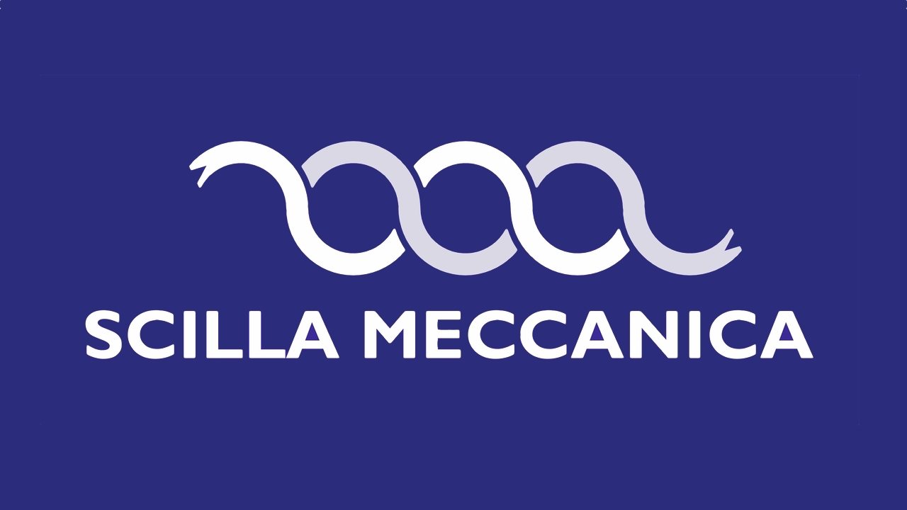
The original Scilla Meccanica logo did not differ much from this approach, but I recognized its evocative potential that had to be explored, freed and amplified.
It was a combination of a logographic element – the inscription Scilla Meccanica – and a pictographic element: two wavy lines superimposed on staggered layers that, I suppose, referred to the dynamism of bushings in the undercarriages of bulldozers, rather than to the rollers of a rolling mill. Maybe you could even see the shavings removal. But what matters, what struck and stimulated me, is the dynamism of this detail. It does not look static. Unfortunately, it was originally thought as a simple decorative factor: a sort of tilde above a disproportionate and elaborate inscription with an outdated font, associated with the “neon” taste of the 80s and 90s.
I suppose the dichromatic choice of color was an explicit reference to the territory of Brescia. White and blue is the banner of the city of Brescia.

The logo: how it became
There are lines that are monsters: the straight line, the regular serpentine, especially two parallel ones. When man applies them, the elements corrode them. Mosses and accidents corrupt the straight lines of its monuments. One line alone has no meaning; you need a second one to give it expression. This is a great principle. Example: in musical chords a note has no expression. Two together make a whole, express an idea."
I understand that the unexpressed strength of the logo could be released by dissolving the clear separation of the two elements: logogram and pictogram can interact to explode an extraordinary evocative value.
They key is in the name: Scilla Meccanica.
Why is this company called so? Meccanica seems obvious. But Scilla, where does it come from? This is the main question that needed to be answered, and it opened up a very suggestive scenario for me.
I discover that the choice of the name Scilla was a tribute to the famous tourist resort, located on a promontory at the northern entrance of the Straits of Messina, in the province of Reggio Calabria. After a youthful summer trip, this place became the place of the heart of Franco Bezzi, the founder of the company, and his wife Angelina.
Those who had the fortune to discover these places, know how much charm and scent of ancient cultures you breathe when you visit them. These are the places of Magna Graecia: “The origins are ancient, confused between mythology, history, legend and poetic images fed for millennia by the suggestiveness of the natural environment” _From Wikipedia, the free encyclopedia, Scilla (Italy), history.
Hence the evocative cue:
Scylla is the nymph of Greek mythology, turned out of jealousy by Circe into a sea monster with six dog heads and long snake tails.
Homer in the Odyssey, Ovid in the Metamorphoses and Virgil in the Aeneid tell of this monster that, together with Charybdis, represented a fearful garrison for sailors in the Straits of Messina.
It may seem a superfluous detail, but it was surprising to me to remind that the reason for Circe’s jealousy was the love of the sea god Glaucus for the nymph Scylla. From my name you can well understand why I was very involved in the topic.
460–450 a.C. - London, British Museum © Public domain
The undulation has a double reading level: the waves of the stormy sea and the sinuous bodies of two tangled monsters. The evocation of the myth becomes explicit and recalls to qualitative and conceptual values, which we find again perfectly expresses in the most famous zoomorphic brands: think of the power expressed by the Ferrari horse, the additional energy of ENI’s 6-legged dog, the sense of trust and security in the flight of Lufthansa’s stork, the feline agility in Puma’s logo and many other examples.
There is shown then the great principle of Delacroix’s double harmonic component as the necessary expression of an idea: there is the undulating interweaving of two snakes that becomes poetry in the dance of two dancers, or roughness in the challenge between duelists. Metaphorical references to a company’s ability to accept the challenge of a market in swift transformation. By making flexibility, dynamism and problem solving the best expressions of a service oriented to satisfy the customer needs.
The stormy sea and monsters have always represented fears for the unknown. The same fears which, according to Plutarch, Gnaeus Pompey found himself exhorting his sailors, riotous to set sail, with the famous phrase: “Navigare necesse est, vivere non est necesse”. Phrase that exactly “traditionally is cited to indicate the contempt for contingent needs and the exaltation of further ideals.” _From Wikipedia, the free encyclopedia, Navigare necesse est, vivere non est necesse.
This is how the Scilla Meccanica company finds its motivation in the courage to evolve, in the value of a transformation oriented to the continuous improvement of techniques and knowledge.
The reworking of the logo ends with the downsizing of the proportions of the writing Scilla Meccanica, leaving its evocative weight to prevail and act as a proscenium for the pictogram.
The chosen font is Gill Sans. A character without grace of Humanist type, created in 1926 but with a very contemporary taste. The web’s on-screen display needs led to a preference for Sans serif fonts.
The blue color was made more decisive by adopting a blue RAL 5002. A deep blue sea, which honors the traditional blue suits of the metalworkers’ world and goes beyond the concept of provincial reality, going back to a wider territorial extension represented by the blue flag of the European Union.
Finally, the team building work undertaken by Scilla Meccanica, which in recent years has become dogma essential for any company oriented to process optimization, finds in the conjugation of meaning between the logogram and the pictogram the very origin of its application force. A symbolic team working that projects the Scilla Meccanica brand beyond the boundaries of place and myth.

Glauco Pigoli
architect - project manager
 English
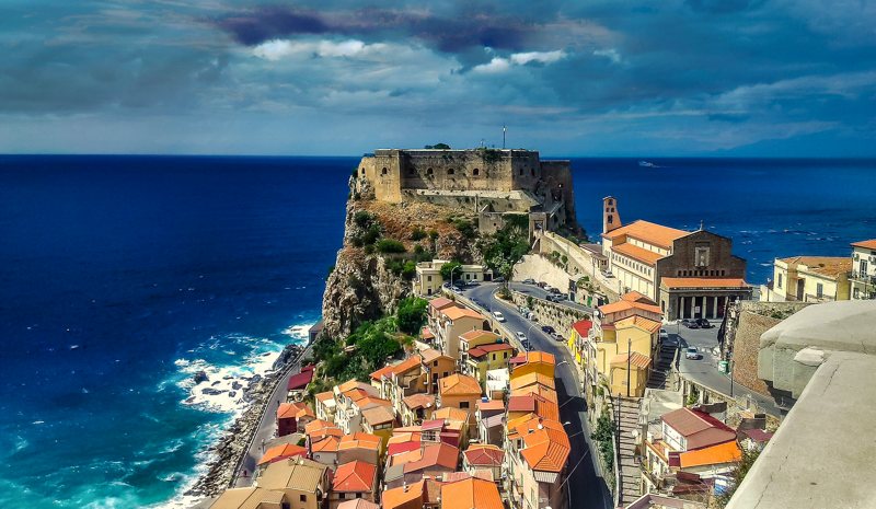